Tuesday 29 April 2014


Wednesday 9 April 2014
EVALUATION
IN WHAT WAYS DOES YOU MEDIA PRODUCT USE, DEVELOP OR CHALLENGE FORMS AND CONVENTIONS OF REAL MEDIA PRODUCTS?
For my music video, I chose the rock pop band Paramores song 'Still into You'. The band is a mainstream band of both the rock and pop genre, as we see from realistic media texts such as magazines and music channels, for example, they can be seen either on the Kerrang! channel, or on the Chart Show channel. I chose to do this song as I really like Paramore and the song, but also I thought it would be interesting for me to reverse the narrative of the original song, for my narrative. My music video fits into three different themes, the first being nostalgia, which is the innocence of youth. This is represented through Blossom and how she is viewed as being vulnerable after her break up. The second being nihilism, which is the belief that there is not future. This is represented through Blossom body language and actions, as all she has been doing is reminiscing about her past, and that there is no life without her boyfriend. Lastly, the third theme is romance, which is shown through the black and white flashbacks that she has throughout the video. My main influences for my music video was P!nk 'Who Knew' as in this video we see the past of a young couple riding fair ground rides together, with the narrative being who knew that their relationship would ever end. Narrative theorist Tim O'Sullivan argues that all media texts tell us some type of story, so I planned to create a video with features of performance and narrative, telling the story of a hopeless young obsessive teenage girl who thinks that her world has ended due to a break up with her boyfriend. From one of my audience feedback polls I was stuck for choice on narrative or performance, so I picked them both as they were both of high demand. Going into even more detail, Sven Carlsson believed that music videos fall into one of two categories, performance or conceptual clips. My music video would be classed as a performance clip, as this involves mainly showing the aritst performing. He stated that there are three types of performance, song,dance and instrumentalm and my video would fall into the song performance category. Also in Paramores original video, they include a narrative and performance, and I thought that they worked really well together. I wanted to keep continuity through out my music video and my ancillary texts, as a conventional pop video tends to tell a story, rather than be abstract. I wanted my music video to express 'real life' and something that teenagers can relate to. Every teenager will go through a time when they have broken up with their first love and be devastated, so I thought that it would be appropriate to use teenage actors in my music video, adding to the 'real life' aspect and successfully representing the audience. P!nk's song 'Who Knew' represents two young lovers at a fairground madly in love. For my video, I chose to use a Park to represent their young love and their free spirits, as I felt that this represented a world of their own, relating to a teenagers first love and how they feel it is just them and their lover in the world. This video also had narrative and performance in it, which is were I got the initial idea for mine to have the same layout, as I thought that it worked really well in contrasting their relationship to when they broke up. With P!nk singing and reminiscing the moments she had with her lover, I used this in my music video, with Blossom reminiscing over Joe and their past. I thought that this again really well to maintain the contrast of the two story lines in my music video. In the background on P!nk's music video we see fairground rides still functioning. I thought that this worked really well to represent how life goes on, and how she is at the fairground still where the two young lovers had their memories. As I didn't use a fairground for a location in my music video, I thought that using snapshots in the background would work really well in showing her memories and how she still thinks of Joe. Narrative theorist Kate Domaille stated that each story ever told can fit into one of eight narratives, so my music videos narrative would be placed in 'Orpheus' meaning the loss of something personal or a tragedy.I thought that this worked just as well as the fairground did in P!nk's background to her music video. I decided just to stick to two actors in my music video, with Blossom singing about her own relationship because I thought it would make the narrative more clearer to my audience, and it makes it more personal, as she is singing about her own experience, relating to the audience.
In relation to mise-en-scene, I had choose specific locations for this, so my music video was able to convey the narrative. The locations that I used were my friends bedroom, Riley Field and West Park. I used my friend Abbie's bedroom as she has photographs of her friends and through school all around her room. I thought that this would be perfect for representing Blossom's memories and how she is unable to let go of her past as well as her ex boyfriend. Abbie's room is only a small room, and I felt that this would represent Blossom's feelings, and how she is feeling cooped up like a bird in a cage. This maintains the narrative in my music video as it is portraying her feelings, which is what tells the narrative in my music video. I chose my second location to be Riley Field (which is located on Anlaby Road) because an open spaced field would convey her feelings of when she was with her boyfriend, and in contrast to the small bedroom, she feels free and alive. The last location was at West Park. I chose this location as I thought that it was a typical location for couples to visit, and it also represents them as being childish. This is aimed at my target audience and their experience of relationships, as the age range is 13-19, so they will be able to relate to this. With that, they will feel more connected with the video, and will engage with it more. In terms of Stuart Hall's theory, this would make my target audience apart of the dominant audience, rather than the negotiated or oppositional. I chose for Blossom to wear different outfits for different scenes. Starting with the bedroom, Blossom wore a black vest top, with a red tartan skirt and black tights. I thought that the tartan skirt would represent the rock genre, as seen on photographs of Hayley Williams. Her hair was simply tied up so I was able to capture the expressions on her face, as they tell the narrative of my music video, and her make up was light, apart from the red lipstick, which connoted her dangerous and obsessive personality on the outside. In contrast to this, on the Riley field location, Blossom wore a white long sleeved shirt with a black and pink floral dungaree. The white shirt was to connote her innocence on the inside, as she is only a teenager and in love. I think that what also added to this was the use of the lens flare edit, which I used to represent small butterflies, representing how in love she is. Also, the bright green colour of the grass conveys her bright and vibrant personality, whilst she is in a relationship in the video. In the third location of West Park, Blossom wore a different black and white polka dot dungaree set with a leather jacket. The leather jacket is very typical of the rock genre, especially black. Blossom wore the red lipstick in all of these scenes, as I wanted to keep the continuity of Blossom's personality throughout my video. For Joe's outfit, after doing a moodboard on males outfits, I decided for him to wear skinny jeans, with an army camo top and his Parka jacket with Vans shoes. All of these items of clothing are trendy at the moment and are typically from the rock or indie genre. This will relate the the male audience of my music video, as they will be able to relate to his clothing style.
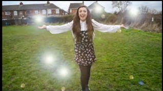


In relation to cinematography, I rarely used a tripod in the making of my music video, as this I wanted to re create the free ideology that Paramore create in their music video 'Ignorance'. This music video consists of the whole band being in a small room playing their instruments, but I felt that it was very effective of the rock genre as the shaky hand held camera shows their 'don't care' attitude to everything. I felt that doing this would also keep my audience entertained instead of using boring still shots for every scene.
 I mainly used close up's and this was to again constantly maintain my narrative in the video, as it was mainly the feelings and expressions on Blossom's face that told the audience when she was sad and happy, conveying my narrative. I felt that the close ups could also make my audience feel more connected with my video, as the shots show every expression on her face, making them feel the same feelings too. The middle close up shots that I used were to show the costume to the audience, as this firstly established what the genre was. I found that from doing my textual analysis's from the beginning of the year, that rock pop videos do use a lot of close ups and medium close ups for exactly the same reasons, making the cinematography of my video suit the conventions of the rock pop genre.
In relation to editing, in my first draft I included only slow cuts, making my shots very long. After giving myself some audience feedback when looking at my first draft, I realised this, and I felt that I need to make the shots faster. This also relates back to the mise-en-scene of the bedroom, and how Blossom is surrounded by snapshots of her past, I recreated this in the video as edits, to flow continuity. After all of my audience feedback I was correct in saying that I did need to use faster edits. There are roughly around three instrumental pieces to the song itself, and these are very upbeat and fast. To match to this, I edited some shots with the beat. through doing this, I found an opportunity to emphasize my narrative even more in my video, by in the quick snapshot edits, having one shot black and white and the other in colour. This was to show the black and white as her past memories, and the shots in colours as the unhappy time she is in at the minute. I used the black and white and normal colour effect all throughout the video, again to promote my storyline. I found that some pop rock videos do include the black and white edit in their videos, and I did this also as someone on my audience feedback thought it would be a good technique to use. P!nk uses the black and white edit in her video 'Blow me one last kiss', which is also about her ex boyfriend. She uses this in the video to represent her memories. Even though her narrative is different to mine, it still works very effectively.
Another editing technique I used was the lens flare on the lyric 'I should be over all the butterflies'. I used the lens flare effect multiple times in one scene, as I wanted to re create the effect of her thinking about butterflies, or for it to represent the butterflies in her stomach that she gets when she saw he boyfriend. Even though they were just glimmers of light, thought that these looked just as effective, as they were also meant to represent the glimmers of hope that she had about her relationship, and how it made her feel like a ball of fire or like a firework. After looking back at my first draft, this lens flare edit really helped to promote my narrative even more so, with how she is feeling. On one of my audience feedbacks again, someone said that it would be a good idea for me to blur Joe and Blossom over each other again in one scene. I took this on board and got straight onto the editing suite. In one scene, were Blossom is sat with her head in her hands on the floor, I blurred over Joe sat on the bench, smiling and being happy. I think that this re-enforces the idea about how upset she is about their break up, and how much she is missing him. This also portrays her obsessive personality and how she cannot stop thinking about him. I thought that this was typical of my genre, as it is dramatically over emphasizing the narrative, which I find pop music videos to do a lot. I also found that the ghost fade effect that I had used creates the same concept as the blur edit. The ghost fade edit was used on Joe when he was sat on the bench drinking a cup of coffee, to show how he was fading away from the relationship, and how he was a distant memory to Blossom. I also used this effect when the couple are sat on the grass talking to each other, to represent the same concept. The way that I used the black and white and colour effect throughout the video to represent her past and present can relate to representation theorist Levi Strauss' binary opposites theory. Her happy past self is a binary opposite to her sad and depressed present self.


In terms of props, I saved a cup of coffee that had bought from McDonalds and used it as a prop. I wanted to use this as a prop in the scene were Joe is sat on the bench as I wanted to show him as being relaxed when in the relationship with Blossom, making the audience even more unsure as to why he dumped her. This can relate to Levi Strauss's theory of binary opposites, with Joe being portayed to be the antagonist in the music video. I find that having a protagonist and an antagonist in a pop rock music video is very conventional, for example in Avril Lavigne's music video 'Girlfriend' she is the protagonist were are the girlfriend is made to look like the antagonist. This is what usually creates a narrative in most pop rock music videos.
In terms of the sound, this was the only part of the music video were I unfollowed the conventions of the original music video to 'Still into You'. I reversed the concept of Paramore's original video, to re create and manipulate the lyrics. I think that I did this very well, and I think that this is what makes my music video interesting, as it is not what is expected, giving the audience more excitement and will to watch the music video. One main thing that I did find difficult about the making of this music video, was organising the days to film, as because I needed three people to be with me when filiming (the actors and Abbie with her camera) it was sometimes hard for us all to make time to be able to film. In the end, I was able to do this. With my first draft, another thing that I found difficult was getting my narrative to flow with my music video, but after having feedback, I was able to understand and re-create my music video to be more successful in performing the typical conventions of the pop rock genre.
HOW EFFECTIVE IS THE COMBINATION OF YOUR MAIN PRODUCT AND ANCILLARY TEXT?

Audience theorist John Hartley argued that institutions need to not just represent audiences but to enter into relation with them, but they must know their audience so they can target them effectively. After researching my target audience in my research and planning, I bared the age of 13-19 year old teenage girls in mind, and started to think about ideas. Girls, typically, especially from the pop genre like pink, so I decided that this would be a good way to enter a relation with them, as it is something they like. I did the same whilst thinking about the rock side of my genre, and decided on the colour black. The pink roses on the inside cover of my album are again there to create relation with the pop audience, but the grungy font is there to create a relation with my rock audience. I made sure that I bared both of my genres in mind whilst making my ancillary texts. Another theorist that links in with this is Jason Mittell, who argued that industries use genre to sell products to audiences. They use familiar codes and conventions that make reference to their audience. Again I did this by using the colour theme of pink and black throughout both of my ancillary texts, as this will appeal to both the rock and pop genre.To create my ancillary texts, I first organised a photo shoot with my main female model featured in the video, Blossom. When deciding on a location, I had many ideas in mind, being Riley field or Abbie's house, which is where we originally filmed, but I found out that Blossom actually had a old bath in her back garden that she was about to get rid of, but before she did I though that it would be a perfect place to film. The bath looked very grungy, and I thought with a bit of editing on Photoshop CS5, I could make it look a bit dark and gloomy, conveying the rock genre across in the image. After taking plenty of photographs, I found that this one was the one that I thought portrayed the genre across.

 After taking the photograph and editing it on Photoshop, I then started experimenting with fonts that I could use firstly for my magazine advert. I chose for my artists name to be 'Emelia'. This is because I find the way that it is spelt quite unusual and slightly retro. I didn't feature the album name on my magazine advert because it was already displayed on the photograph of the front cover of my digipak. If I had of done so, my advert would of looked really cluttered, I wanted to keep it simplistic and straight to the point, so my audience have chance to read it. Below are the fonts that I had experimented with for both of my ancillary texts. All of them The three fonts that I had chosen (which is shown in the red boxes) I chose because I thought they conveyed the rock pop genre and also I thought that they would look really good with the photograph above, because they also have a grungy and messy look. When decided on a font, I needed to start looking at how to sell my album to my audience. I added the artists personal website to the advert, to create realism and verisimilitude to my ancillary text. At first I did originally use the amazon logo advert, but I decided against the idea and chose to use the iTunes logo, this was due to my audience feedback. I also used the Sony Music logo, as this is a popular institution with many artists such as P!nk and Maroon 5, which are from my chosen genre. I wanted to use the colours pink and black to connote my genre clearly to my audience. The pink connotes the pop genre, with the black connoting the rock genre. I also find that these two colours really go well together, because they are such a contrast from each other, and the pink stands out from the black.
 Moving onto my digipak album, I chose to do a digipak 6 panel with 2 CD's. I used a template from a website that I was provided with and saved it on Photoshop. The front cover of my album is the same as what is on my magazine advert. I did this so both of my ancillary texts tied in together. Originally for the front cover for the album name 'Still Into You', I had a different font, which was more plain than my most recent one. I decided on changing this because it looked very out of place with the rest of the album. I kept to the same colour theme which I did when making my magazine advert, so that if my audience saw them both together, they would know that they are from the same artist. This could also be seen as a good way of promoting and selling, because if they both look similar, it could tempt my audience to want to buy both products, making them successful. When I did my first filming day, I took plenty of pictures to test out for my digipak album, but I found that I really liked one of the pictures that I took, so I used this for the back cover of my album. The costume that she is wearing really connotes the genre, with the tartan and band skirt connoting the rock genre, and her hair and girly make up connoting the pop genre. On the back cover I also stuck to the same theme, to keep my theme and genre flowing throughout both ancillary texts. One thing I would change to my back cover is maybe add something more, maybe like the website, or a quote from a magazine, as I find now that it does look slightly plain. I used Sony Music as my music label, as it apart of the Big 3 in the music industry, which means that it is one of the top in the world, so my album would benefit from this more, rather than being placed in an indie label.
Because I had two disk CD case, I had to design on Photoshop two different CD's. I thought what would look really well is if I make one CD black and one CD pink, with alternate background colours. This did work out really well, and gave my album a bit of vibrance, but I think that the CD's are what keeps my pink and black colour theme flowing the most, as the stand out a lot. Again on my CD's I used the same grungy font on my front cover and magazine advert, again to combine both of my ancillary texts. On the digipak, the top row of the template, so my two CD's and my inside cover had to flipped upside down, so that when I printed it out, they were not upside down.Instead of using the transparent effect to make a space for CD's, I decided to design my own CD's, because I think that it looked more realistic and finished.

For the inside cover photos, I used the same images, a bit like Rhianna's digipak. I loved the way that she had used the inside cover photos to all join together. She did 3 inside cover photos, were as I could only use two. I took the idea of the roses, and fitted it to my digipak. I went to my uncle's flower shop and took some pictures of pink roses. When I took the pictures of the roses and added them to my album, I decided that I wanted them to feature in another one of my products, so I decided it to be my music video because I didn't have an introduction in my first draft, so in my second draft I added the roses to my music video along with my artists name and song name on top of the image.


As well on my digipak, I needed to include the spines the CD case. I decided again to stick to the colour theme of pink and black to keep both of my ancillary texts tied in together. I used exactly the same font as throughout the album again to keep continuity. I kept it very simple, as I had only had a small space to work on obviously with it being a spine cover, so I didn't want to overflow it too much.
The aspect of what I found most difficult when making my digipak was trying to make all of my images fit well with each other. I had to do a re shoot for the front cover album because the images that i had taken on filming day 1 were not very professional. The hard thing was trying to find a location and costume that would link the photograph in with the rest of the ancillary texts. One thing I feel that I have achieved is keeping the colour theme continuity throughout my magazine advert, digipak and music video. I tied my music video in with my ancillary texts by using the roses at the introduction of the video, but also through on the ancillary texts, with the colours not only representing the genre, but the pink representing happiness and love and the black representing dark and depression, which fits in exactly with my narrative. My front cover of my album represents the typical and conventional ideology of artists 'posing' and looking good for all of their photo shoots. This represents the pop genre, but what Blossom is wearing, which is a shirt, isn't seen to be very girly, and i chose this because this is what brings out the rock genre in the digipak, as well as the colour theme. This typical ideology can be referred to by Laura Mulvey's 'male gaze' theory, the fact that women act and dress the way they do to be looked at by men, which is the typical pop ideology.
As well as just creating and producing my ancillary texts and main product, I thought that it was important to show my products as a real life product. Firstly to do this, I chose two magazines that were from the rock pop genre, which were Kerrang! and Q. I chose these because typically, they would include artists such a Paramore inside their magazines, especially Kerrang! Paramore have been featured in both of these magazines, so I thought that these magazines were ideal to use. I printed out my magazine advert on A4 paper, and stuck it down onto one of the pages in the magazine, to make it look like it had in fact been published in them. The fact that my magazine advert dominates the whole of the page is what I intended to do, as it will catch my audiences eye and will gain their attention immediately, which will up sell my product.

Paramore featured in Kerrang! and Q


Another way I demonstrated my products being realistic was by screen shooting a song playing on someones iPhone (Paramore - Still Into You) and copying that onto my computer. After doing this, I opened up the image in Photoshop CS5, as well as opening up my magazine advert. I copied my advert on to the iPhone screenshot using the rectangular marquee tool. After doing so, I scaled down my image to the size of the picture of Paramore, and placed in on top of the original image. The font on the music player still said 'Paramore - Still into You', so to deal with this, I used the paint brush tool, used the colour white and went over the top of it. I then had to find the correct font to use, to make it look realistic. I used the Ariel bold font in black and typed 'Emelia - Still into You'. I thought that this looked really realistic. I also thought it would be best to use the music player on iTunes, as the iPhone is linked with iTunes, which is the main online music store that people use. Also, when I first did my poll on the side of my blog, one of the questions I asked was "Which of these applies to you" with the multiple answer choice of "I illegally download music a lot" "I buy my music legally" and "I never buy or download any music". 7 out of 16 people stated that they download music legally, with 5 saying they illegally download, and 4 saying they never buy music. This makes the majority of my audience legally download music a lot. Looking back at this, it means that they will use iTunes to download their music, making the iPhone a brilliant place to advertise my album.

.jpg)

.jpg) The third way in which I advertised my album through my magazine advert was on a bus stop. When i was out in town I took a picture of a bus stop. I noticed that nearly every bus stop advertises, so I thought that it would be a great place to use it. I used Photoshop again to edit. Firstly I opened up my original image, as well as my magazine advert, and then I copied the advert on top of my original image. I then had to scale it down to fit over the image correctly. After doing this, the colours on my magazine advert looked too bright, as they were block colours, and not very realistic. To solve this problem, I adjusted the levels and brightness on mode to tone them down. This made it look a lot more realistic. Bus stops are high traffic areas which are visited a lot during the day by many people. I thought that it would be a perfect place for my target audience, 13-19 year olds, to spot this advert, as they will be using the bus for school, college or even to go into town on a weekend with their friends. Representation theorist Jib Fowles stated that in advertising, males gaze and women are gazed at. I believe that this is true, and I wanted to put this theory to action, which is another reason as to why I placed my advert at a bus stop, as it will be seen by many audiences, including males.
The third way in which I advertised my album through my magazine advert was on a bus stop. When i was out in town I took a picture of a bus stop. I noticed that nearly every bus stop advertises, so I thought that it would be a great place to use it. I used Photoshop again to edit. Firstly I opened up my original image, as well as my magazine advert, and then I copied the advert on top of my original image. I then had to scale it down to fit over the image correctly. After doing this, the colours on my magazine advert looked too bright, as they were block colours, and not very realistic. To solve this problem, I adjusted the levels and brightness on mode to tone them down. This made it look a lot more realistic. Bus stops are high traffic areas which are visited a lot during the day by many people. I thought that it would be a perfect place for my target audience, 13-19 year olds, to spot this advert, as they will be using the bus for school, college or even to go into town on a weekend with their friends. Representation theorist Jib Fowles stated that in advertising, males gaze and women are gazed at. I believe that this is true, and I wanted to put this theory to action, which is another reason as to why I placed my advert at a bus stop, as it will be seen by many audiences, including males. 


 Again another way of portraying my ancillary texts and music video as being realistic was by using web 2.0 and the online music charts. I used the main chart website BBC Radio One to display this. I thought that by doing this, it is not only making my product look realistic, but it is also promoting my genre, which is pop rock, as it is usually stereotypical conventional pop songs that are featured in the chart, sometimes there can be some rock or dance music. All the latest and most downloaded songs feature in the charts, also the songs that are in the charts are played on the radio, another way of promoting my product if I was able to. To start off, I print screened the BBC chart page, and opened it up onto Photoshop. After cropping and pasting my image onto the page, I could start my editing. I scaled the image down to what the size of the original band '5 seconds of summer''s album photo was, and placed my image on to of that. I needed the find the right grey colour to paint over the blue text which stated the bands name and song, so I could replace it with mine. This took some time, but eventually I had found the right colour, and was able to write in the font Arial Rounded MT Bold which suited the rest of the fonts on the page, in the blue colour like the rest of the texts. I chose to put my artists song at the number one spot, as this dominated all of the page, and it is what is most popular.
Lastly, as a way of showing my product as a realistic media text, I placed my digipak on a chart shelf. I printed out my album on A4 paper at first, but I found that when I did and folded it all together, it was really small, and wasn't the size of an actual album. To solve this problem, I printed it off on A3 paper instead, and that worked very well. I took my digipak in hand to the ASDA superstore, and found the charts shelf. With permission, I took out the original label of the CD that was there, and placed mine in the spot. I took pictures of what it looked like, and I found that it looked really realistic. I thought that ASDA would be a good place to take my album to, as it is a major food shopping store, therefore making the CD, games and electronics department exclusive to the store. With it being exclusive, people are more likely to go and have a look round. With ASDA being apart of Walmart, it is a conglomerate. This means that ASDA will have a whole range of other shops due to Walmart, so my album would be placed in each and every store that is apart of the conglomerate, making my my album spread more vastly to my target audience. One negative about this is that I wish I had taken it to the HMV store instead. This is because it is more likely to attract my target audience, rather than ASDA, and it would be seen more by the people who I wanted it to be seen by. In conclusion, I found that my ancillary texts and music video look very realistic, even when placed in a realistic setting such as a supermarket or online using web 2.0, they also link in very well together, especially with the specific colour theme and font that I stuck to.


WHAT HAVE YOU LEARNED FROM YOUR AUDIENCE FEEDBACK?
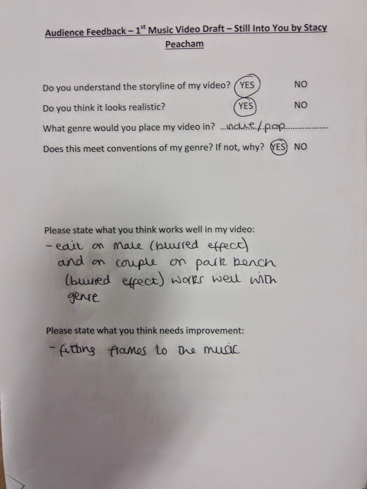
Audience theorist Julian McDougal stated that in the online age, it is getting harder to concieve a media audience as a stable and identifiable group. I found this to be true when researching online about Paramores demographics, as different websites stated different ages. Finally I found the mean age to be 13-19, typically teenagers, so I bared this in mind when asking for feedback from my peers. I decided that for my first draft of my music video, I would hand out questionnaires to my peers to see what their thoughts and advice were. I thought that it was important to get responses from people that did not feature in my video, so I knew that their view wouldn't be biased, as I wanted their honest opinion in order to improve.
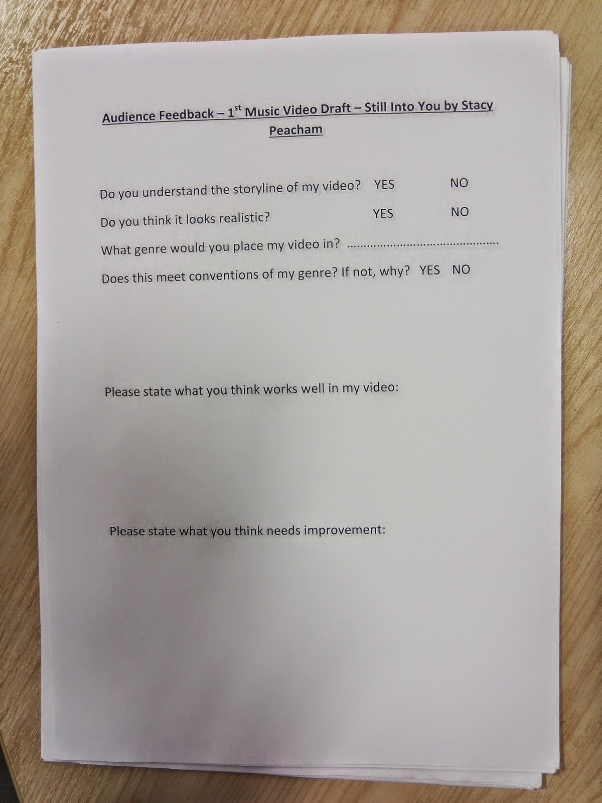
This was the questionnaire that I printed out using Microsoft Word 2010. The questions that I asked were all about making sure that my audience understood my music video, but also what were the positives and negatives about them. I purposefully asked my target audience age ranges which is 13- 19 year olds. The youngest audience member I could get to participate was 15, but this still gave me a wide range of answers. I learnt a lot from this questionnaire.


I also wanted to do a feedback for my ancillary text, so I used web 2.0 to locate the presentation website Prezi. I have used this all throughout the year and it is brilliant for making presentations. I questioned four people for this survey, and here are the responses that I received.
.
One of the main criticisms I got of my magazine advert was that the amazon logo looked unrealistic, and that I should maybe change it to a iTunes logo, as the company relates to music. iTunes is more of a social media also, rather than Amazon, I would say that also it represents globalization on a wider scale, because it is such a huge company, it is also known for making iPods, iPhones, iPads and MACS, not just a music downloading provider. iTunes can also relate to the digitization of music, as it specializes in selling music, unlike amazon, that would just sell the album, were as iTunes would sell the album and the song a-la-carte, by itself. Another form of feedback that I gained from my peers was posting my final draft of my music video using web 2.0 and the social media website Facebook. I decided to use Facebook, as it is a got spot for my particular target audience, as nearly all of teenagers today use the social media. I also used it as people are able to like my video, and tell me what the think of mt video, either it being a negative or positive comment. On the post, I tagged Joe, Blossom and Abbie in it, as they all participated either directly in my video, or behind the scenes. Also, when you tag someone into a post on Facebook, their friends will be able to see the post, therefore spreading my music video effectively on social media. It was also very easy for all of my viewers to watch, as to view a video on Facebook, it streams directly to your computer, mobile, tablet etc, making it accessible in all forms of technology. From doing this, I got plenty of comments and likes on my post. All of the comments stated how good it was, and what they liked about it, which really made me feel that I had progressed a lot from my first draft and the previous audience feedback that I had gained.

Finally, for a last bit of feedback on my video, I decided to do a focus group, on Jack and Joe. Even thought Joe was in my video, both Jack and Joe had seen my develop from my first draft to my final draft on the editing suite, so I thought that they would be able to interpret if I have developed. From this video, I had learned that I had developed more so from my first draft, which is what my aim was. My use of the fast editing is what caught peoples eye the most, which is what is conventional of a typical rock or pop music video.
 From doing an online poll at the beginning of my advanced portfolio, I found that 66% of my audience preferred my music video to contain a narrative and a story line, but also, 26% liked to see a band performance. With this, I decided to mix both of the ideas together. In my music video, some scenes for example when the scenes jump from black and white to colour, that tells the storyline of my music video, were as when Blossom is singing alone, either on Riley Field or in Abbie's bedroom, I would class this as a performance, as she is singing directly towards the camera. This is why I used close up's on most of the shots in the bedroom, because I wanted to convey her feelings across to the audience as well as the lyrics, as they play a part in conveying the story line too. Mixing both a performance and a narrative, is very popular in a rock pop video, as P!nks video 'True Love' shows below. When she is in her dressing room, singing at the mirror to herself, this is the idea of a performance, as she is singing, whilst no story line is happening around her in the scene.
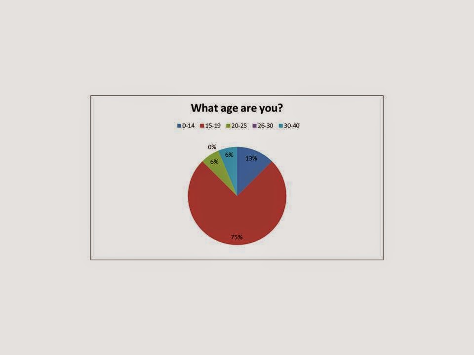
Some other poll questions that I asked were 'how many hours a week do you spend on Youtube?'. I thought that this would be an important question to ask as Youtube is a form of web 2.0 and a music streaming site. My music video would be most likely to be viewed on this website, so I wanted to make sure that it would get a lot of publicity. The question 'What type of genre of music do you prefer' was a key question is figuring out what music video I was going to produce. I gave five different music genres to pick from, so I knew that the audience were certain in what genre they liked, but also because only giving a few answers would give my audience limited choice, making them possibly feel forced into picking an answer they didn't necessarily want to. This increase the validity of my poll, and the validity that my target audience will like that certain type of genre. 37% of my audience preferred the rock genre, with 18% preferring the pop, R and B and Dance genre. I was stuck for choice on this, as after having a high demand for three genres, I was stuck with which one to pick. In the end I ended up choosing the rock and pop genre, as they are the genres that go well together, and the genre that teenagers will listen too. The other key question that I asked was 'What age are you', this was crucial in linking genre with age, as then I would have a rough idea on what my target audience would be. 75% of my audience were aged 15-19, which made up the majority of my poll. I was happy with this target audience range, but just to make sure, I checked at the official Paramores demographics, and their target audience was 13-25 years old. In looking at this, I decided for my target audience range to be 13-19 year olds, as it is more of a range, and they are all classed as teenagers, which is what my typical target audience is.


 Moving back onto my final draft of my music video, I visited my Youtube account to have a look at the analytics of my video, to find out who had been watching it and from were. From adding my music video on April 8th 2014, I already had gained 246 views, which means that my video has been successful in being a realistic media product. Unfortunatley I did not have enough views to determine wether or not my audience were mainly males or females, but I was able to determine where my audience had been watching my video. I found that 244 of my views had been viewed in the United Kingdom along with another one view from India and another view from Australia. Even though this is only small scale, it has shown that through the use of social media, streaming and web 2.0, that my product is able to be viewed anywhere around the world. It also demonstrates the power of using web 2.0, and this is also an example of my music video portraying globalization. From these analytics, I was able to determine the top playback locations as well as the top traffic sources. It shows that the top playback locations of my music video was on the Youtube page itself, but 35% playback locations were from embedded players on other websites. This is most probably from this website Blogger, but again this shows how web 2.0 and streaming has made my music video global, and how easy it is to access other medias. Looking at the top traffic sources, 48% were view referrals from outside of Youtube, 48% was from mobile traffic and the further 3.7% were view referrals from Youtube. This shows how powerful sharing and social media websites are and how my audience has a strong connection with media technologies, other than computers and laptops.

 Another media technology that enabled me to view if my products had been successful or not was Blogger itself. On the over view of my page, I am able to view how many views I have had on my blog, and the top traffic sources. Even though this audience may not be going on my blog to specifically view my ancillary texts and music video, it is still there for them to view if they wanted to. Overall, I have 1236 page views, with one of the main traffic spots being from the Google engine. When I view my audience statistics, it shows that I have page views from the UK, the US, France, Germany, Indonesia, Russia, Kuwait, Serbia, China and South Korea. Again, even though this audience may not be looking at my blog for my video, they are still looking at my research and planning, and they are able to look at my music video and ancillary texts is they wish to. This again is a example of globalization, with my blog being viewed across the world, and it shows how many people use web 2.0 and Google itself.
HOW DID YOU USE NEW MEDIA TECHNOLOGIES IN THE CONSTRUCTION, RESEARCH, PLANNING AND EVALUATION STAGES?
I used many different media technologies in the creation of my ancillary texts and music video. I used the website Blogger, to post all of my work on to quickly and easily. I am very used to Blogger, after using it last year for my AS coursework.

When creating my music video, I used Adobe Premier CS6 on the editing suite. I found that this was really easy to work with. I firstly uploaded all of my footage that I had taken on my friends camera, which was a Nikon D3100 camera, which is an SLR. I used this because I thought that it would be easier than having to rent out a camera from the media department, as I could use my friends camera when ever I needed to, which came to an advantage when all of the cameras at college were booked out for the weekends. This SLR camera was also good because it was only small, and had a neck strap that allowed you to rest it if you needed to. With it being small and light, It allowed me to film from all types of angles and shoot all types of camera shots, for example the tilt that is used when Blossom sits down on the bed, or the high angle that is used when Blossom jumps up from the bed to the wall. I found that this camera produced my filmed shots in excellent quality, but one disadvantage that was my fault and not the cameras, was one of the shots was slightly blurry, as I didn't change the focus of the camera. Premier allowed me to snip video files, add effects, video transitions, sound etc. It also allowed me to reverse and slow down or speed up the scenes in some shots, for example when I wanted to reverse Blossom tearing up the paper, to show how really, she wishes she didn't have to do that. When uploading my footage to premier pro, I labelled each footage by the shot number, with my shot list beside me, so I was able to access the shots more easily, without looking through them all. I began filming after Christmas, I am glad I did, as this gave me plenty of time to film and edit my shots, so I was able to take time with my product, rather than rushing it. This use of media technology helped me to portray my narrative and story line to my audience, which is crucial. On my audience feedback from the social media website Facebook, a friend commented saying how she loved this part from my music video, making me sure that I had done well in fulfilling my genre and my target audience. I decided that I would rather use Adobe Premier CS6, as I found the Macs too complex to use, and felt more comfortable on a editing suite.
At home, I also used on Windows Vista Windows Movie Maker, when making my story board animatic. This helped me get to grips of what I would be producing with my music video, and this helped me prepare.
Looking back on this, it made me see how much I have developed from the start of A2. I used the website Youtube to upload all of my videos onto, including my animatic, my first draft and my final draft of my video. This streaming site, a bit like Facebook, allows users to like, dislike and comment on videos. It also allowed my video to be accessed by a large scale of people, as discussed about on my audience feedback. As well as using more complex programmes and websites, I also used simple Windows programmes such as Powerpoint, for making little presentations such as my moodboards or simply just pasting images onto. I used Excel to make the pie charts based on my poll as one of my first audience feedbacks. Even though these are simple everyday used programmes, they are still apart of media technologies, and played a part in planning and construction of my products.
 As well as using the Nikon D3100 SLR camera to video on, I also used an OLYMPUS camera, from college, to take pictures on, for example my magazine advert shown in a magazine, and my digipak shown in the charts. I used this camera as it was very convenient, as it has a small memory card slot, that I could take out and put into the computer using a memory card reader. The camera was also excellent as it is high quality, making all of my images look professional and clear.
One main media technology that I used was Photoshop CS5 to edit my images and create my ancillary texts. I was able to edit my photographs effectively using tools such as the adjustment to levels, colours, brightness, contrast etc, for example I had to edit the inside front cover for my digpak, adjusting the brightness and the levels, to make the photograph more pale in order to fit in with my colour theme of my products. For the front cover of my album, I was able to use tools such a the blemish tool and the spot remover tool, for slight blemishes on Blossoms face, still making the photograph look realistic. I made my own photographs of Blossom and Joe stood together. I did this by taking a picture of them both separately, and editing it on Photoshop. I used the magic lasso tool around Joe, the pasted him onto the image with Blossom. As he looked slightly out of place, I used the blur tool around his figure to make him fit in more. I also had to scale him down to make him look more realistic in the photograph. Overall, Photoshop CS5 enabled me to produce, create and edit my ancillary texts effectively, making the look realistic and as real professional music products.

I did use a Sony handycam to film my focus group on the second draft of my music video. I used this as it is lightweight and easy to use, with simply pressing the record button to start recording. Along with this, I also used a tripod to place my video camera on top of. This was to keep the shot steady, making the video look more professional. To access all of this, I used a simple DELL college computer, which has all of the above programmes on. This helped me use Photoshop, Blogger, and use Web 2.0 to access streaming and social media sites such as Youtube and BBC Radio One charts. On the DELL computer is were I have all of my media work saved from the year, so I am able to access this whenever I want. I also used my friends Apple iPhone 4, to take a screen shot from the iTunes music library for my ancillary texts. This media technology helped me develop to show how my ancillary text could be seen in a real life context.
I used the social media website Facebook, to post my final draft of my video onto. This enabled my target audience to view my music video as a realistic product, and also enabled me to gain feedback of what my peers thought of it. This then helped me to develop my final draft of my music video. I used web 2.0 to access the music chart website BBC Radio One charts. This was so I could take a screenshot, and save it onto Photoshop CS5 so I could edit my album front cover to the charts. This helped me again show my ancillary text as a real life product in the world. Sometimes when I didn't have a camera on me, I used my own mobile phone, the Samsung Galaxy S2 to take pictures for my ancillary texts, for example the picture of the bus stop. I also used my phone to connect with my female and male model, to organize times and places for meeting for when I wanted to film. This made it extremely easy for me to organize days and times for when to film, as well as letting everyone else know, therefore making my filming day successful even before filming. I used the Google Search engine to search for images when I needed to, for example I used Google when searching for examples of digipaks. Google is really quick and easy to use and helped me a lot in my planning and research when I needed it.

Subscribe to:
Posts (Atom)